
Netflix Redesign Challenge
Amplifying Social Recommendation Attribute:
Suggest TV Shows to Friends
Intro:
As a personal project, I completed a 5-day Netflix redesign challenge. The goal was to choose a feature or section to produce a responsive, user-friendly, and globally appealing interface.
Approach:
As a frequent Netflix user, I have noticed that I often spend more than 10 minutes navigating through shows before finding something to watch. This extended search often becomes overwhelming, to the point where I've occasionally abandoned the website.
This led me to wonder about others' experiences with navigating Netflix to find shows, prompting me to explore and understand whether this is a common challenge. Hence, I decided to navigate Netflix’s homepage to find opportunity for the improvement.
Considering the highly limited timeframe of the project's duration, I developed a 5-day project timeline to lead the project in a timely manner:

Research
Because Netflix is a global platform, I believed that it is critical to understand how global users use and feel about the current Netflix experience for designing a universal user experience. I reached out to 3 active users with different nationalities: United States, Canada, and Korea.
Overall, all the users shared their thoughts on Netflix’s recommendation feature.

Based on the users’ feedback on their experiences with Netflix, I have identified the following UX issues on Netflix’s recommended contents:

Since Netflix is a globalized streaming platform, it is important to consider how the recommended contents can cater to diverse audiences. The key globalization factors I considered were:
Use universal icons: Despite language and cultural differences, I utilized icons that are universally understood across diverse audiences. This use of universal icons would make interacting with the feature easy and without a steep learning curve.
Take localization into account: I employed carefully chosen words to prompt diverse audiences to take desired actions. These words would be easily translatable so that users can use the improved feature effortlessly.
Conceptualization
Having completed the research, I identified that social recommendation is a primary desire for the target users. To bridge a gap between the user needs and Netflix, I decided to enhance the platform’s recommendation feature by adding a new functionality: share/ recommend contents to friends directly through the platform.
By incorporating this sharing feature, Netflix can leverage this social integration to gather valuable data from the users’ viewing histories and recommended contents to watch by their friends. Therefore, the platform can enhance its ability to curate personalized contents for each user.
Then I designed a user flow of 2 users’ interaction: User 1 recommends a show on Netflix to User 2; User 2 gets notified that a show has been recommend by User 1.


For both web and mobile versions, I replicated the latest iteration of Netflix as much as possible to encapsulate the look and feel of the platform’s most recent version with the new functionality.
1. I planned on naming this new social recommendation feature as “Share with a friend”. However, when I navigated Netflix's mobile application, I found that Netflix already has a “Share” feature, which allows users to copy a link to a TV show or movie to share with friends on social media (Figure 1).
While this feature is not offered in the web version, I decided to rename the feature to “Suggest to a friend” so that users can easily distinguish that this new functionality is different from the existing “Share” feature.

Fig. 1 Users can share a TV show/ movie’s link by clicking “Share” on a mobile application
2. For the mobile version, I replaced the “Share” feature with the “Suggest to a friend” feature for the conciseness so that the phrase can be aligned with the layout of the show/movie list. I decided to keep the “Share“ feature as part of the new social recommendation functionality (Figure 2). I find these two features relative because they allow users to share shows and movies. While “Suggest to a friend” allows Netflix users to share shows with other users through the platform, “Share” allows the users to share shows with non-Netflix users.

Fig. 2 Users can suggest a show to friends directly on Netfilx or share it on social media
3. I put the “Suggest to a friend” option in the show information page so that users can suggest a selected show to their friends immediately. Considering how to display this feature, I aligned the design with the “Add to My List” and “Rate” options because these are the actions that users can take, regarding the selected show (Figure 3).

Fig. 3 “Suggest to a friend” option on web version
4. The layout of these options are consistent on mobile versions in order to provide responsive elements (Figure 4).

Fig. 4 “Suggest to a friend” option on web version”
Design
Visualizing the concepts, I created low-fidelity prototypes of web and mobile versions. You can see more details on the Miro link:
As a final step, I designed the high-fidelity prototypes. During the process, I considered using the paper plane icon for the "Suggest to a Friend" feature (Figure 5) since it typically represents online sharing. However, as Netflix already uses this icon for mobile sharing, I explored other options. I discovered that the offering hand gesture is a widely recognized symbol for suggestion or recommendation. The aim was to create a unique icon for the new feature that works well on all devices.

Fig. 5 The paper plane icon is replaced with a hand gesture icon.
high-fidelity prototypes:
add how to share (3 screens) | mobile version 3 screens
how users receive it (2 screens) | mobile version 2 screens
shortcut (2 screens)
Flow 1: User Suggests a TV Show to a Friend (Desktop)

It’s holiday season. Gina is on Netflix to find a holiday movies or TV shows to watch. After watching Love Actually, she enjoyed watching to movie and wants to share the show to her friend, Bridget.

Gina clicks the Love Actually thumbnail. She clicks the hand gesture icon.

As soon as she hovers the icon, the “Suggest to a friend“ tooltip displays for offering helpful guidance to users.

Gina clicks the icon and sees the new interface displays: “Suggest to a Friend“. With this feature, she can see a search box, friends list, and suggest to all. To look for a friend’s name, She can scroll the friends list or type the friend’s name in the search box. If she wants to suggest the show to all her friends, she can click “Suggest to all“. In this particular use case scenario, I made an assumption that users have the option to upload profile pictures on Netflix, enabling others to easily identify and recognize them.
Since Gina already sees Bridget’s name on the list, she clicks Bridget.

The interface checkmarks Bridget’s name. The “Send“ button appears at the bottom with the paper place icon to visually convey that the action will send the suggestion to other users. If Gina deselects Bridget, the button will automatically disappear.

Gina clicks the "Send" button. A toast notification with a confirmation message appears at the top, and the displayed message may vary depending on the technical capacity.
Flow 1 (Mobile)

Gina clicks the “Suggest“ icon. The feature’s name is shorted on mobile interface to match its style and consistency to those of the other action buttons.

Gina sees the “Suggest to a Friend“ page.

Gina clicks Bridget’s name. Gina sees the “Send“ button, so she clicks it.

On mobile devices, the toast notification will display at the bottom because it is a common user interface practices observed in other mobile platforms.
Flow 2: User receives a suggestion from a friend (Desktop)

Bridget is on Netflix. She sees that she got a notification, so she clicks the notification icon.

A new notification displays: “Suggested by Gina - Love Actually“. When users receive suggestions, they can see the friend’s name and title of the TV show/ movie. Bridget is curious, so she proceeds to click the new notification.

The Love Actually preview page appears. On this page, she can see “Suggested by Gina“ with the hand gesture icon. This message will stay at this page whenever Bridget comes back to this page.
Flow 2 (Mobile)

On mobile device, Bridget can see all notifications by accessing “My Netflix“. Depends on how she sets her notification, she can also be notified by in-app notification or email about her friends’ suggestions.

She sees the “Suggested by Gina”. She clicks it to find out more.
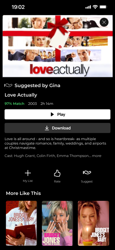
She can see that the movie has been suggested by Gina.
The Feature’s Scalability
Throughout this brief project, I thought how “Suggest to a Friend” feature scale overtime— the social element of the feature has opportunities to grow, such as friends can send message as they send TV show/ movie suggestions. Also, users can rate the suggested show and share it with the friend. I believe that this idea is worth for further exploration.